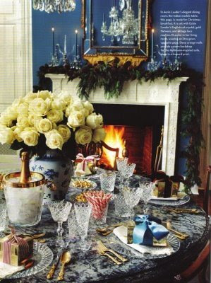
 Back in December folks were ohhing and ahhing over Aerin Lauder’s home in the December issue of (the much missed) House and Garden. I seem to remember a bit of discussion about the choice of blue candles in the dining room. Hmmm…..blue. I’m usually an all white girl when it comes to candles, but could see that, for the image at least, white would not be right.
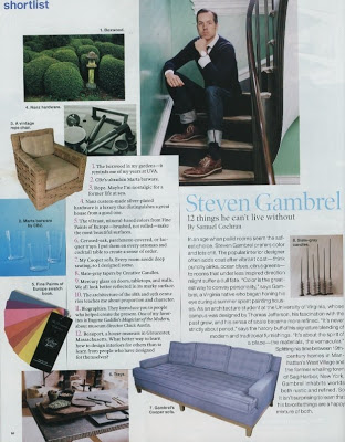
 Then, one of the features I always look forward to in Elle Decor, “shortlist” featured Steven Gambrel’s list of things that he cannot live without.
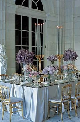
And look. Number 8 is slate-grey tapers by Creative Candles. I adore Creative Candles; they are on my list as well. Unfamiliar with the slate grey I emailed my friend at the company and asked if she could provide an image. I was expecting a snap of her holding a handful of said shade when she provided a link to the image below.
 Courtesy of Grace Ormande Wedding Style, the slate grey tapers preferred by Gambrel. I have to say, I can see the appeal. I am drawn to the crispness of the white, but the grey is more subtle. It does not become the focal point. Graceful and lovely, it does the job without screaming for attention. I need to listen to Jennifer; this color deserves a second look.
Lauder image, and style inspiration, courtesy of The Peak of Chic.


I look for candles on sale and they are usually the wacky colored ones. I have ebony, pale green, bright yellow, lilac, but alas, no gray! It is subtle and chic.
The grey is subtle, sort of Impressionist-ic…like it… although generally favor white also. Remember reading that Mark Hampton favored black candles in dining rooms, used them in his own DR.
The blue candle controversy is one of my favorite Peak of Chic memories 🙂 I mentioned it in fact to Jennifer just a few weeks ago.
Suzanne Rheinstein favors black too, depending on the season. I talked my mom into trying this and it’s a super chic look with silver, in the right interior.
I have used slate gray for years. It’s a quiet color that goes with everything. It simply disappears.The white tapers do not do that. Glad you like it! Once you use them you will never turn back.
Ah yes, the blue candle controversy! I actually have some slate gray candles that I’m waiting to use (don’t know if they’re Creative Candles or not.) My favorite color is black- it looks wonderful against silvers and creams.
WOW! Those candles are spectacular! I have some pale green ones that look incredible with silver. But I will look for grey.
Grey is a great choice for so many occasions, I think. I also love these very subtle sage green ones that I found and bought scads of.
I LOVE the blue candles…the flame
is more pronounced.. looks romantic…The blue however,will not work in my dining room, going to try the slate grey for my next dinner party! Thanks for the tip!
I’ve used grey with my father’s silver, grey and white Rosenthal china, they play nicely with the silver sticks and the grey linens. I’ve even used burnt orange with the Wedgewood Kutani Crane china (matching cream and orange Belgian linen mats and napkins.) At first I thought it was over the top, now I can’t imagine not doing it….