Tag Archives: blogs

Did She Have a Little Work Done?


A few commenters have noted the change in Mrs. Blanding’s appearance.  At his elegant home on Saturday night, David Jimenez mentioned Patricia van Essche’s charming illustration that I use for the header of the blog.  It made me realize I hadn’t “seen” it in a while.  I started Mrs. Blandings almost a year ago.  For a while, her title was simply typed at the top of the page in red, then Patricia created the engaging illustration above just before I was headed to New York.  Enchanted, I knew it must be my header, but blogger was a little trickier then and I couldn’t quite figure out how to do it.  Eventually, I created the old image in Word (it’s funny how far you can come in a year), printed it, scanned it and posted it.

Courtney, at Style Court, was gracious and noted that it had a vintage feel.  OK, so it was a little fuzzy, I’d get back to it later.  I wasn’t thinking nine months later, but that is kind of how I work.  After David’s comment caused a mental nudge, I realized I could easily update the header, which lead to a little more tinkering.  The template is the same, but I changed it to a wider version to expand the margins a bit.  “Wordy,” this keeps the text on Mrs. Blandings from looking quite so long.
I also changed the font.  This is cleaner, I think, and I am a Arial user in “real life” so this is a better fit for me visually as well.  And it’s larger, which might be a little easier to read on screen.  Overall, I think it’s crisper.  I initially changed the background color to white, and I must say I liked it, but I could not give up this gentle shade as I’ve grown so accustom to it.
I know it takes the eye a while to adjust to change.  Hopefully, Mrs. Blandings just looks better and fresher, not different and strained as sometimes happens with cosmetic alterations.   Or so I’ve heard.
rssrss      FacebooktwitterpinterestlinkedinmailFacebooktwitterpinterestlinkedinmail

Up to Something Crafty

Both Style Court and Katiedid posted on Alan Campbell and his amazing fabrics and the wonderful homes in which they have been used.

David Netto wrote an engaging article for domino this month detailing his relationship with Campbell who served as a sort of ad hoc godfather.

Not all of Campbell’s fabrics were batiks, but some of the most graphic and compelling certainly were.

The grade school I attended in Tulsa was progressive for its day; there was one year when we were all lumped together, a jumble of grades, working at our own pace. I know I read a lot, but likely did very little math.  I did make designs with the metric blocks; those were cool.
Lucky for me our art teacher was amazing. One of the best projects was batiking. Making batik. Mr. Blandings does not like it when people make nouns verbs, especially if the noun is golf, which a game. If you say “golfing” you get a very slow blink. And a sigh.

Anyway, while I was in sixth grade, a mere thirty-one years ago, I remember it being a piece of cake. We did do more of a design than an abstract pattern. I think mine was an elephant. Regardless, it seems like it was some fabric, a little wax, some dye and off you go.

Could be a great summer project. The wax is hot. I know, you got that, but I thought it needed to be said. So, be careful if kids are involved. Which you also got, but just in case. I doubt you could do enough for a sofa before school starts. But maybe a pillow. Or a foot stool.

Well, you could.  And I might.  If I do, I’ll show you, but if I don’t show you please don’t bring it up as it will be one of the dozens of things I have said would be fun to do this summer but didn’t.
All images borrowed without permission from Quadrille.  Fabrics, Alan Campbell, bottom image, The Devil Wears Prada.  If you are interested, google “how to batik.”  Dozens of sites are available to show you how.
rssrss      FacebooktwitterpinterestlinkedinmailFacebooktwitterpinterestlinkedinmail

Bordello Chic


Mr. Blandings attends a conference every year in Las Vegas.  I haven’t gone for a while as it falls during the last week of school, but when the boys were still at home and not demanding my attendance at programs and parties off I would go arm-in-arm with Mr. B to the city of sin.


I adore Las Vegas for all of its excess.  On our first trip there together we were behind a rather scandalously dressed young lady at the Bellagio.  Mr. Blandings leaned over to me and whispered, “Get a load of that outfit.”  “Darling, she’s a professional.”  “What?!  Can’t be – they don’t let them out; they keep them someplace.”  You can see why I like him.
So when 
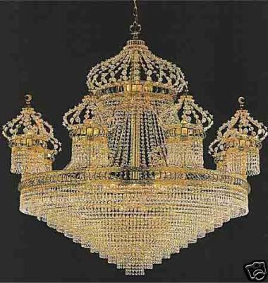
Maison 21 posted this chandelier and confessed that he found it jolie laid I had to agree that it was magnificent in its extravagance.  In fact, I commented that it would be great fun as the starting point in the decoration of a house of ill repute.  Then M21 raised the stakes and double-dog dared me to do just that.  Here’s my vision of where “they” would “keep them” in Las Vegas.  
I usually flip right by the “Opulent” chapter of Influential Interiors, but today I use it as my inspiration.  No one does old world over the top like Albert Pinto and Jacques Garcia.

Reds and golds and greens with lots of gilt seems just the thing.  I think you get the idea.


To begin, let’s imagine the outside is quite discrete.  Non-descript, but with helipad for the L.A. traffic.  Indeed, a private club.  A gentleman’s club, and, to further qualify it, let’s say MSW.  Catering to a straight clientele enables us to focus without swinging both ways.  As you swipe your card to enter, a lovely young woman would take your bag and check your phone; no photos please.  This vestibule would be paneled with sheets of malachite off-set by brass fillet similar to the Astor library by Albert Hadley.

The floor, a black, honed marble covered by this handsome beauty, soft beneath your shoe.


 A quick check to ensure you are still as dashing as you remembered.

A little shaggy?  Happy to fix you up if you are in need of a little trim.

All set?  Up two honed black marble steps into the main room.
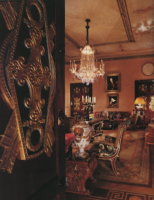
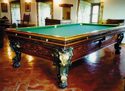
The ceilings would need to be two stories; the chandelier is a monster and would need to be well hung in the dead center of the room.  Civilized and sophisticated, the clientele would surely settle in for a drink and perhaps a game of pool.  

You’d want to unwind, shake off the daily grind.  Another associate would be happy to fix you a drink.


Let’s use this charmer to set up the bar.  Even here, the Victorian wall-length bars seem unsophisticated.  A cigar?  Certainly.

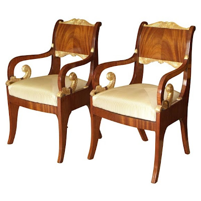
Men, I’ve found, like the idea of being stylish, but not at the expense of comfort.  The one exception to this rule may be women as they often choose based on aesthetics and find themselves with a difficult and itchy match down the line.  So, following the style of Pinto and Garcia we will use comfy sofas, perhaps a pair of these

and then this in another seating area

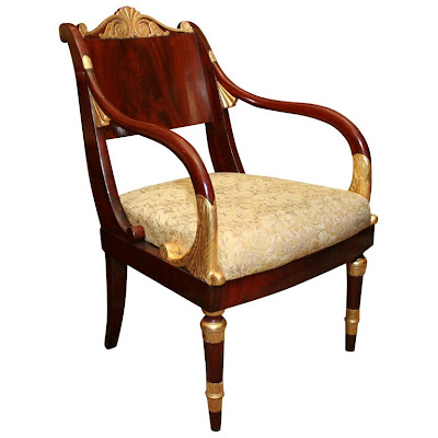
and scatter lots of chairs like this


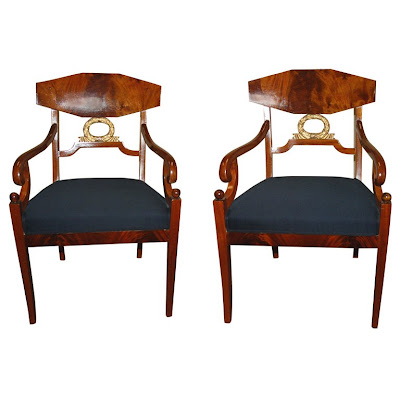
and these, as I couldn’t’ resist them and the leather is so yummy, to assuage the gilt a bit.

in fabrics like this


This would give our lovely working girls some spots on which to drape themselves.  I have in mind a stable of the Eastern Block lovelies resembling those who have graced the runways over the last few years.

I think the establishment could benefit from upholstered walls, so I’d use a red wool.  It should be red, agreed?  A patterned broadloom to keep everything cozy and easily cleaned.


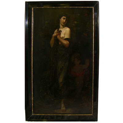
On the walls, some antique oils, nudes, of course.  You know.  Classy.


And I can’t resist the thought of this Walton Ford. A little tongue-in-cheek poke at the natural essence of the business sprinkled with a little ugliness.


As an aside, when I as interning at Nightline my senior year in college a visitor to the show had seen me in the production booth and inquired if I were Sydney Biddle Barrows.  Of course, the producer corrected the error, but was surprised that I didn’t see the humor in the anecdote.  “Who knew you were such a prude?”  “Prude?  Never!  I can’t believe he’d think I was she.  She must be ten years older than I.  At least!”  
All furniture and furnishings 1stdibs except the pool table which is antiquebillardtables.com.  Rug Doris Leslie Blau; Carpet Karastan; Fabrics Scalamandre.  Malachite is Fornasetti paper.  
rssrss      FacebooktwitterpinterestlinkedinmailFacebooktwitterpinterestlinkedinmail

Chic Treat

Of all the wonderful things blogging has brought me, the introduction to creative and talented people is the most thrilling.  What a treat Saturday night to be included in a dinner in honor of Heather Clawson, blogland’s own Habitually Chic.

It was a lively crowd, and HC has done a much better job than I would have capturing the evening.  I’m thrilled that Kansas City made such a nice impression; now you will know I’m not on the take from the Chamber of Commerce.  (I’m not.  Really.)
My editor, Zim Loy was a gracious and lovely hostess and we were all treated to the magic of her culinary cohort, Merrily Jackson, who is aptly named.  The highlight of the evening, besides the sparkling conversation, was Merrily’s dreamy coconut cake.  Even if you don’t think you like coconut, you’ll be begging for a second piece.
Miss Merrily’s Heavenly Coconut Cake
1 18.5 oz box yellow cake mix, the kind with pudding
3 eggs
1 c. whole milk
1/3 c. vegetable oil
Frosting
2.5 c. heavy whipping cream
1.5 c. sour cream
1.75 c powdered sugar
1 7 oz. can Baker’s sweetened coconut
Prepare cake according to package directions, substituting milk for water.  Bake, as directed in two round cake pans.  Cool and split each layer, making four thin layers.  Prepare frosting by whipping cream and sour cream together until soft peaks form.  Whip in sugar, then stir in most of the coconut, reserving about a quarter cup.  Frost top of each layer, stack and frost sides.  Sprinkle reserved coconut over top.  Serves 12.
Can be make a day ahead.
Mrs. Blandings, left, Habitually Chic, obviously, right.  Recipe originally printed in Spaces Magazine Oct./Nov. ’06.
rssrss      FacebooktwitterpinterestlinkedinmailFacebooktwitterpinterestlinkedinmail

Peak Perception

Jennifer is nearly always right.  Her comment on yesterday’s post led me to Tory Burch’s apartment in Vogue Living, Houses, Garden, People.  I own the book.  I’ve looked through it a dozen times, but sometimes your perspective changes.  Now that Jennifer had pointed out the Walton Ford painting in the entry, I noticed how many things on this one page were in keeping with my style stalwarts.

First, boys playing in the house.  Pure joy.  Oversized art.  Lacquer.  Conical light.  A little gilt.  A little black and white – and ticking – and bunk beds for the boys.  Large white pottery jar.  Blue and red used beautifully together as tribute to the Jayhawks.  OK, maybe that wasn’t Tory’s intent.
Mr. Blandings is checking in as I study and write.  “Auction?  Still?”  “Mmmhmm.   I’ll be right up.”  Like a kid with the flashlight under the covers, I just can’t let it go.
rssrss      FacebooktwitterpinterestlinkedinmailFacebooktwitterpinterestlinkedinmail